April 19th 2019
PRINT EDITION RELEASE NOTES by Tessa Yee

In March last year, Eyestorm released the first three works in a new series by British artist, Jo Bradford, titled ‘Portals’. This series illustrates the development of Bradford’s camera-less photographic technique - a continuing refinement of her unique self-taught method. Today, we are excited to be introducing Portals: Orange, the fourth edition of the Portals series, which furthers Bradford’s exploration of pure colour through subverted photographic methods.
Jo Bradford’s current artistic practice is the result of many years experimenting in her photographic darkroom with the technical and chemical processes of making analogue photographs, eventually developing a unique method of capturing light on chemically sensitised paper that allows her to create photos without the use of a camera or digital intervention - known as Luminograms.
Her work has been driven by a desire to perfect this technique, initially using it to explore figurative images such as landscapes, but overtime focussing in on her primary interest - colour:
“I am always hyper aware of colour in everyday life. I feel like my consciousness is stimulated by colours coming at me from every angle.” - Jo Bradford
Today Bradford’s work can be described as non-objective - spectacular luminous images where the subject is colour, and the medium, light.
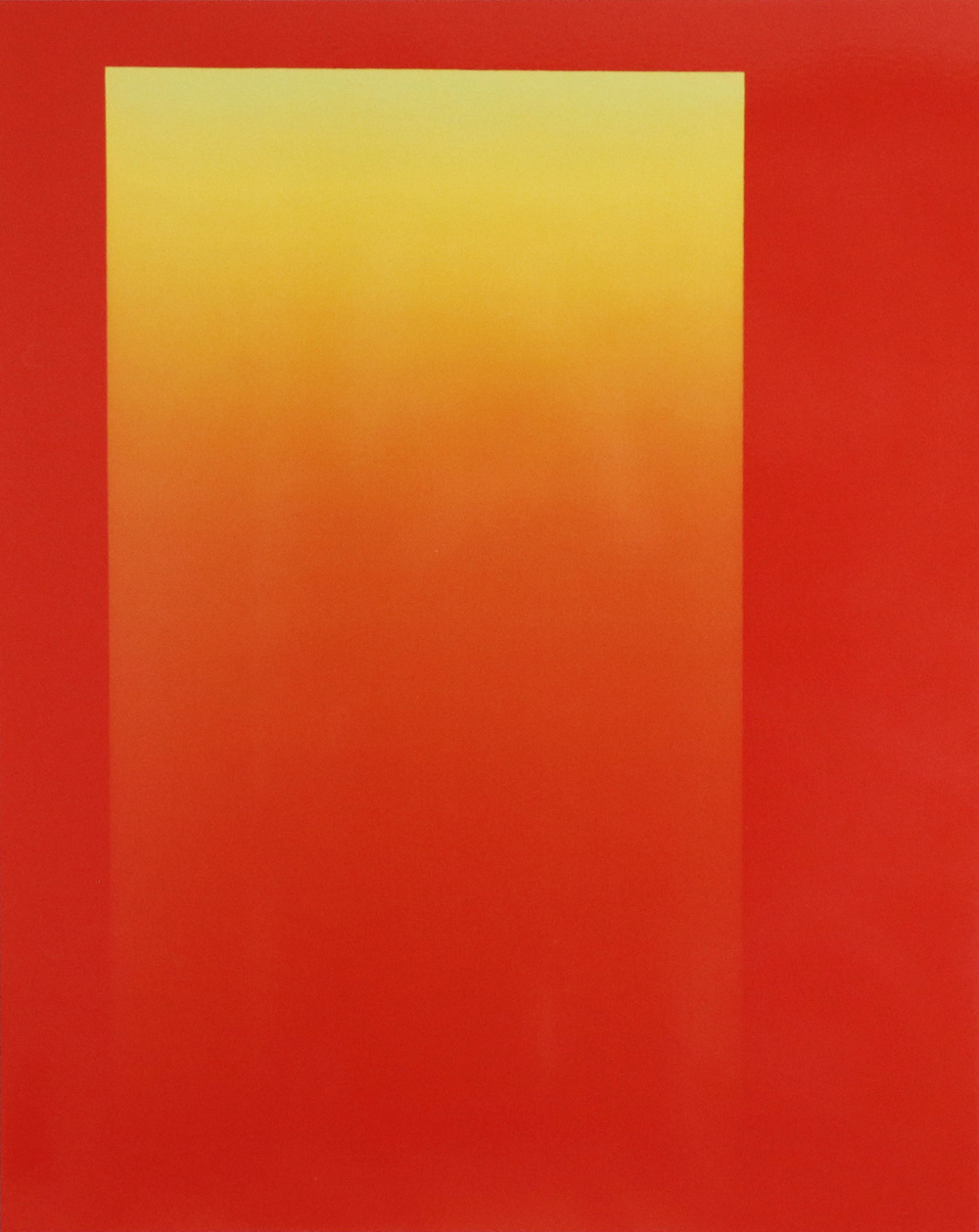
As seen in the previous releases Autogenesis and Continuum, Bradford is especially interested in exploring colours that she believes have been ‘left in the shadows’ - the minor colours of the spectrum, or those that sit in-between the primary colours of the rainbow. In Portals, Bradford concentrates this study on a particular colour of interest - turquoise, which she feels should have had a primary role in the naming of the rainbow hues. Portals explores the range of tones available in this colour from the lighter end of the scale, right through to the darker shades - revealing the simple way in which hues can be altered by nothing more than the intensity of the colour.
Alongside works that specifically use shades of turquoise - for example her previously released Portals: Teal - in this series, Bradford has produced complementary images which explore the way opposing hues can affect the perception of colours when seen together. In today’s print release Portals: Orange, Bradford uses an intense orange tone from the opposite side of the spectrum to turquoise. When put side by side with Portals: Teal, we can see a subtle shift in the way the hues appear in this juxtaposition, as opposed to how they appear on their own. The blues are much cooler, the oranges hotter, and the dark areas appear deeper and more intense. There is a push and pull between the opposing shades of teal and the bright sharp orange hues, creating a visible contrast between seeing these images as individual works, and side by side. This effect is not incidental, as Bradford carefully selects hues that will work with the series in its entirety, as well as individual artworks in themselves. She is asking us to consider our own observation of colour, revealing it as not a constant, but a continuous shift of perception.
Bradford’s obsession with colour has been influenced by some of the great colour field and light artist of the 20th Century. Like the abstract expressionist Mark Rothko and Josef Albers, Bradford presents her works as flat abstract colour planes, eliminating references to any object, and instead focussing the viewers on appreciating colour in its purest form.

Perhaps an even closer comparison is the way in which Bradford creates her colours and shapes from light - much like the ‘Skyscapes’ and ‘Light Tunnels’ of the great light artist, James Turrell. Like Turrell, Bradford is ‘painting with light’, exploring our perception of light and colour through the juxtaposition and comparison of different shades and hues - demonstrating the subtle shifts and changes that are always occurring.
However, unlike such light artists who work with installations, Bradford’s Luminograms allow the work to be trapped on paper, to be taken home and appreciated on a more personal scale. And unlike the colour field artists whose medium is paint, Bradford’s colour work appears in a transparent layer of chemistry on a white sheet of paper. In this way, the colour application does not dim the purity of the white behind it, as happens when paint pigment is applied to a white background. Instead, the colour in Bradford’s work is recorded in its purest form - within light.
You can find Portals: Orange and the other pieces in the ‘Portal’ series on Jo Bradford’s artist page here.